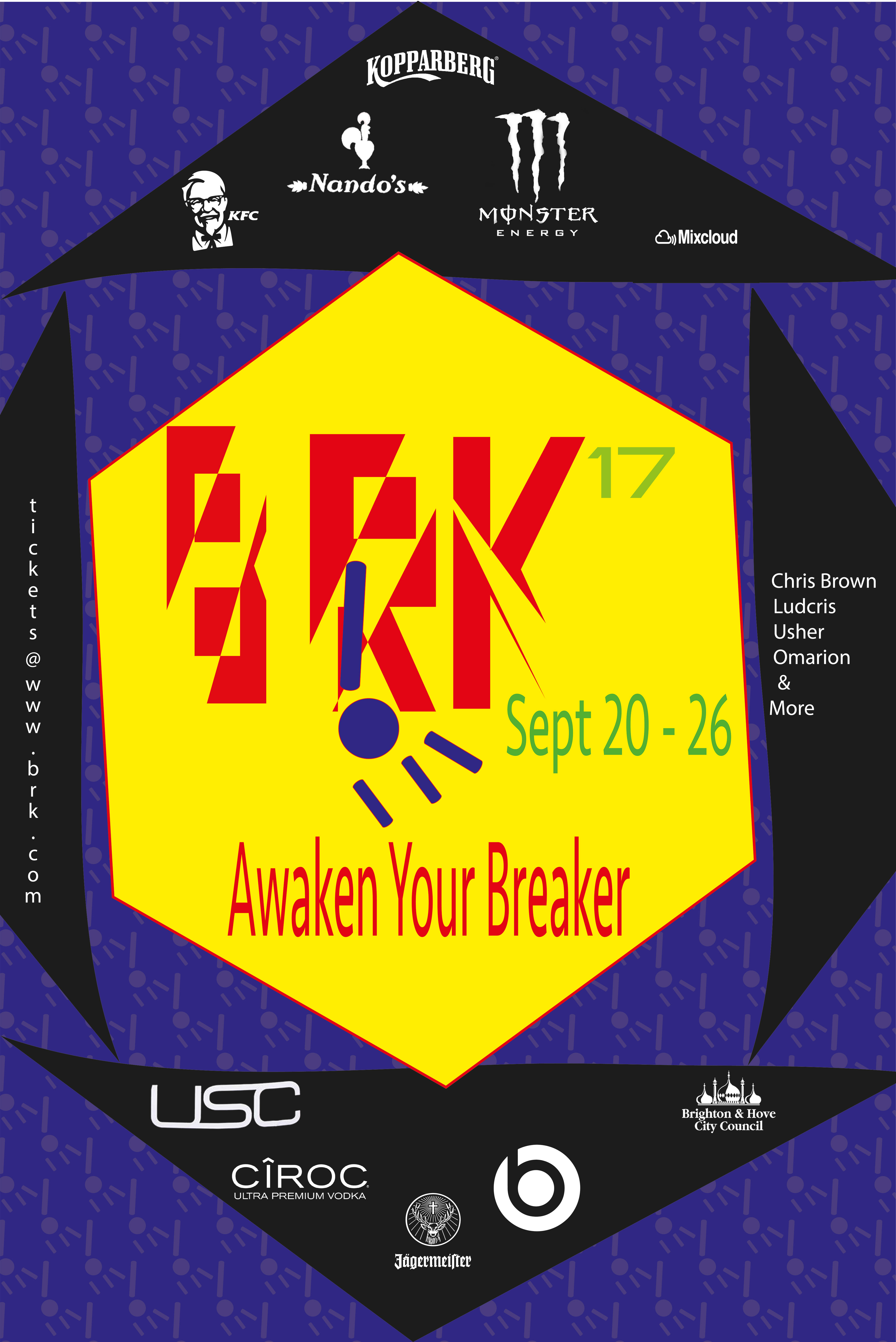
The brief for my final digital design project was to design branding for a festival and apply it to a range of products that suited it. Seen here is my final logo for my festival. My festival is based on break dancing as this my favourite dance to watch and have been interested in it from a young age.
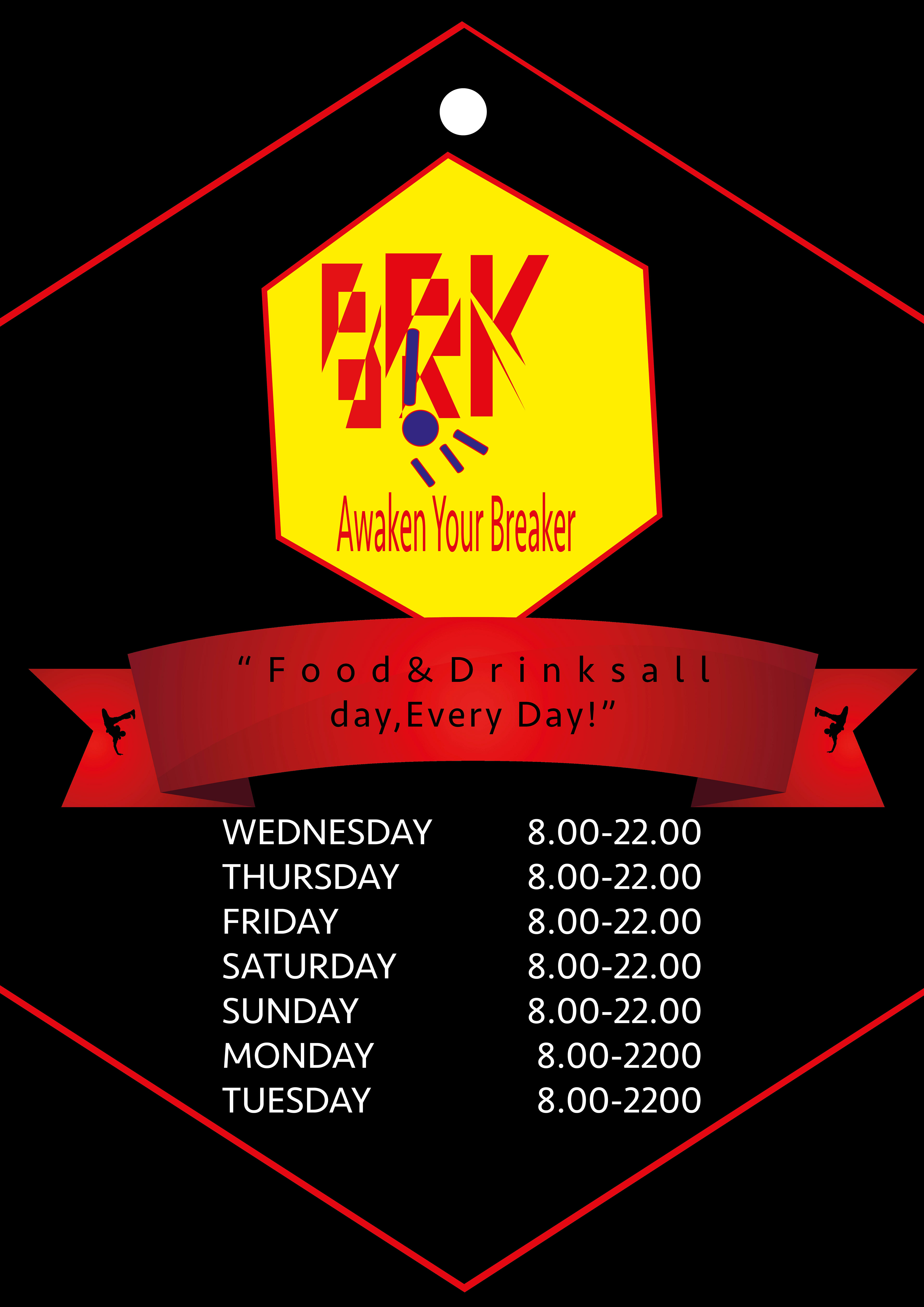
Shown here various pages from my lanyard. Its shape is based on the logo for the festival. Each of the pages would be cut after the red outline. The white circle on each page represents a hole where the hook would go though. It is in different places on each page as it is designed to be worn around your neck.
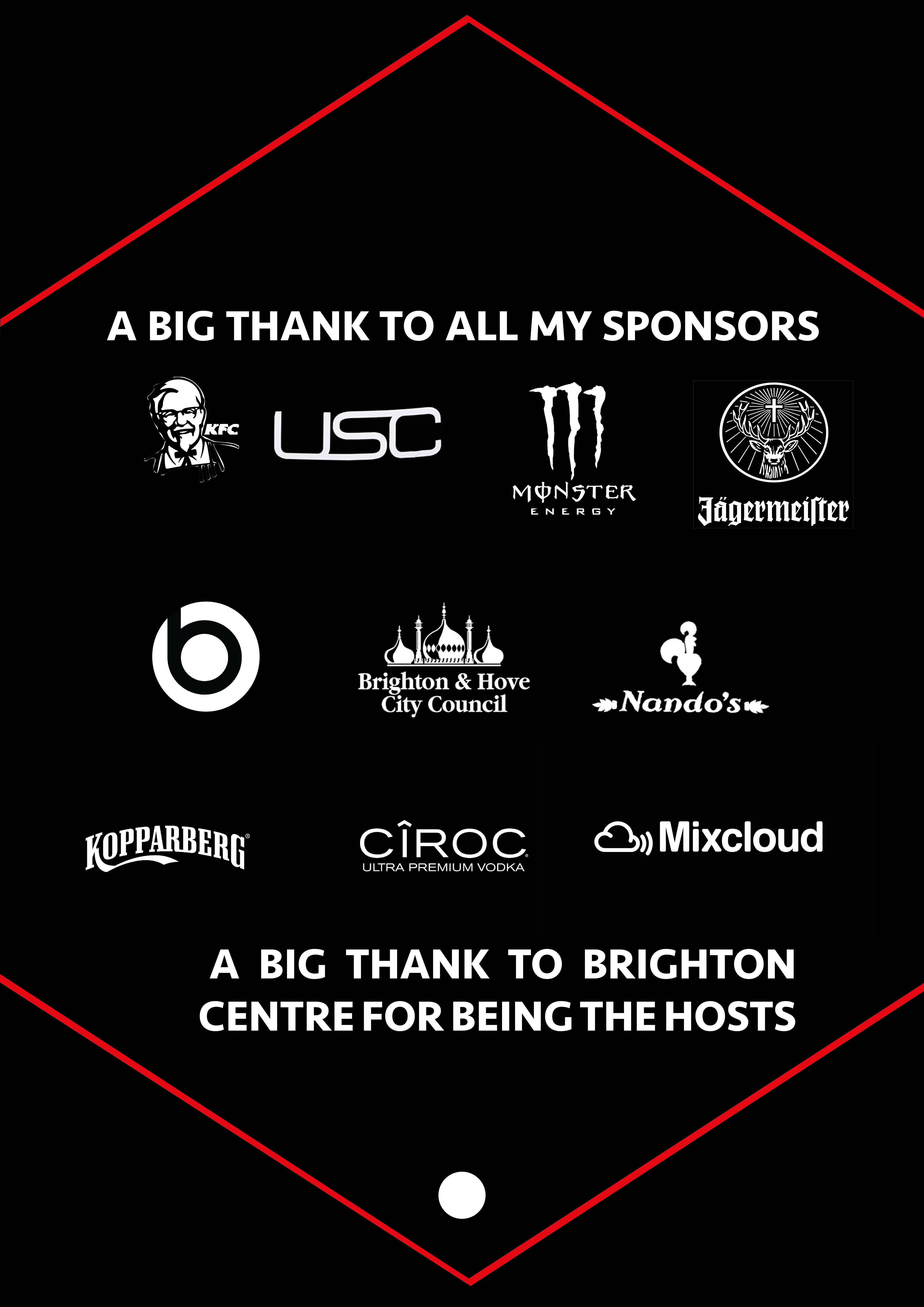
Shown here various pages from my lanyard. Its shape is based on the logo for the festival. Each of the pages would be cut after the red outline. The white circle on each page represents a hole where the hook would go though. It is in different places on each page as it is designed to be worn around your neck.
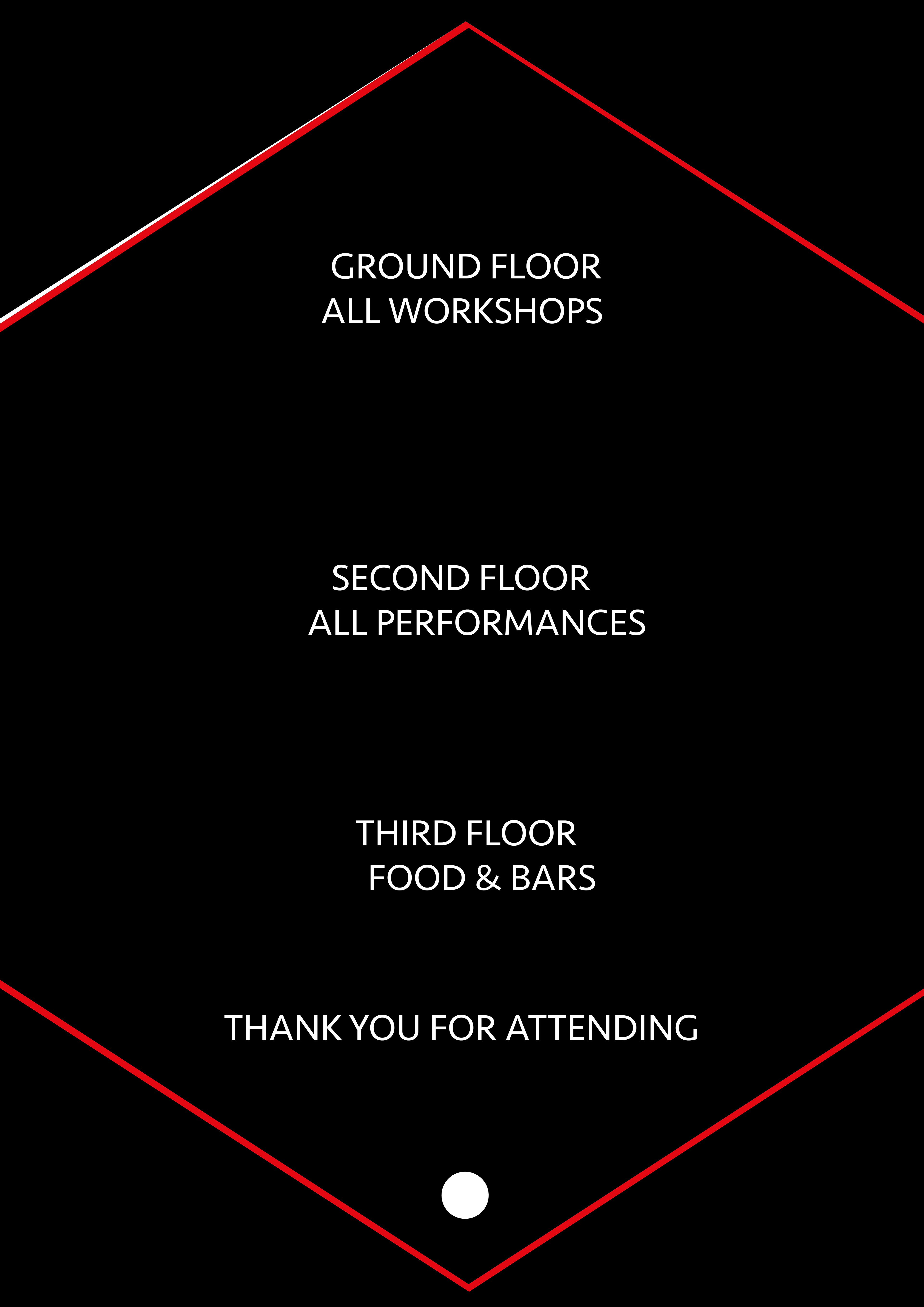
Shown here various pages from my lanyard. Its shape is based on the logo for the festival. Each of the pages would be cut after the red outline. The white circle on each page represents a hole where the hook would go though. It is in different places on each page as it is designed to be worn around your neck.
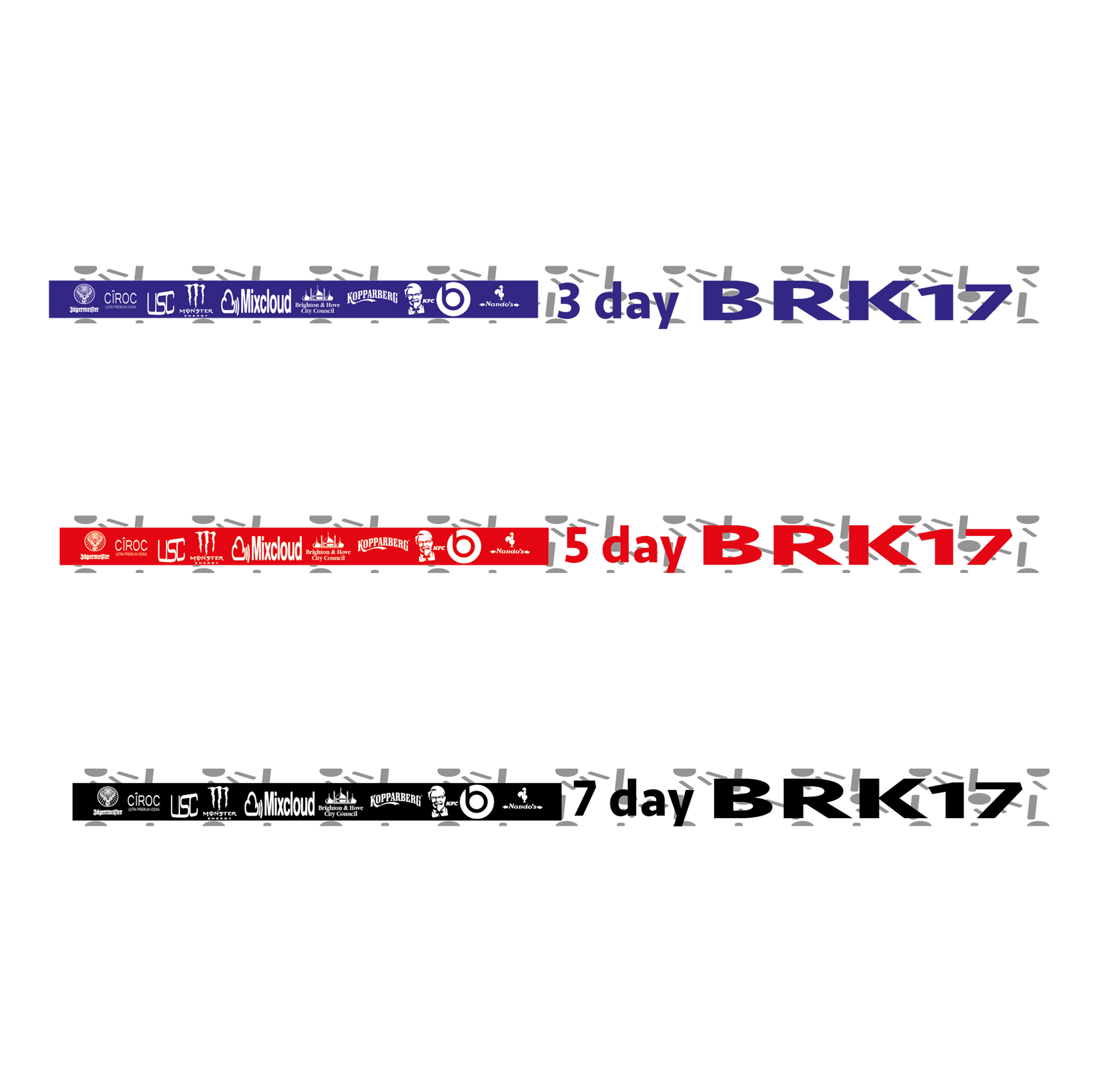
Shown here are some of the merchandise & ephemera of my project. There are different wristbands depending on your budget.